
Portfolio
Smoke Dragon

Agenda
Background
Problem Statement
Research insites
Wireframes
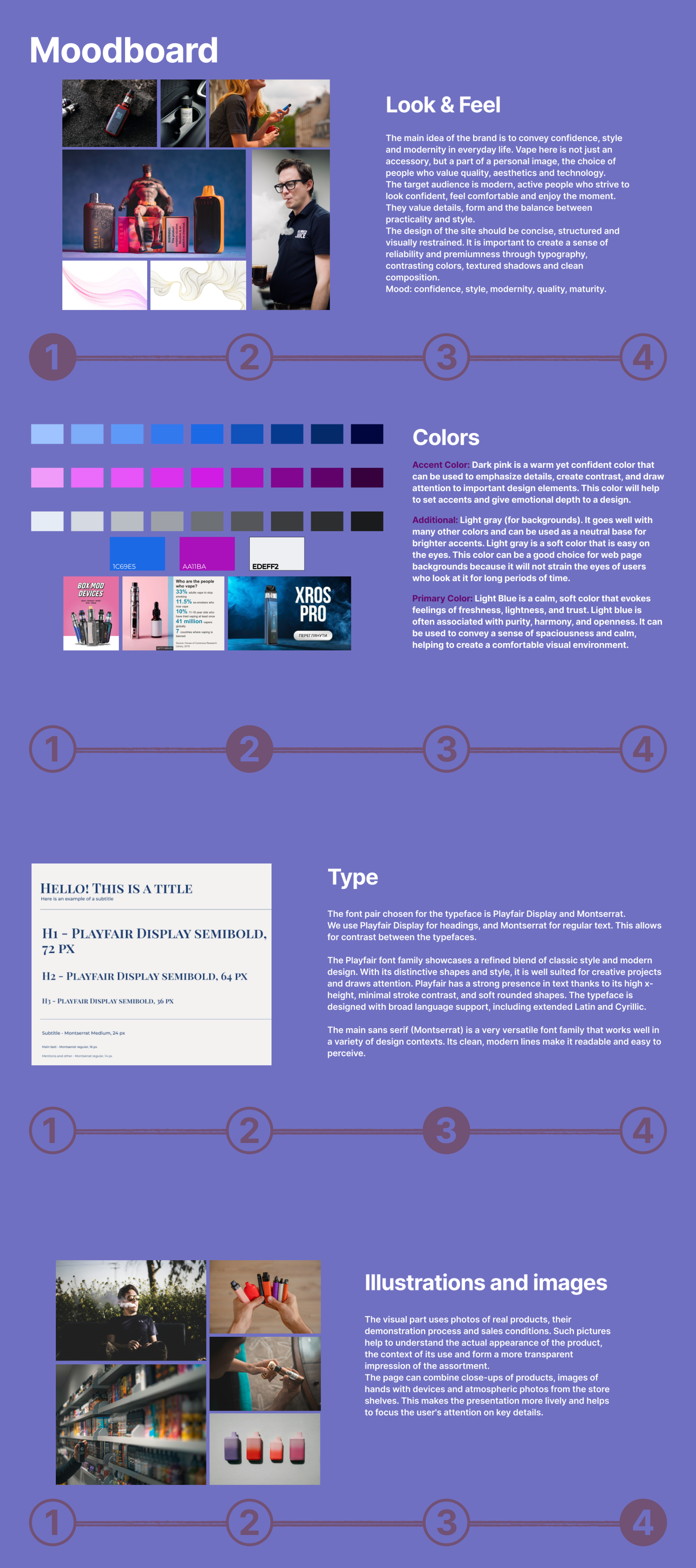
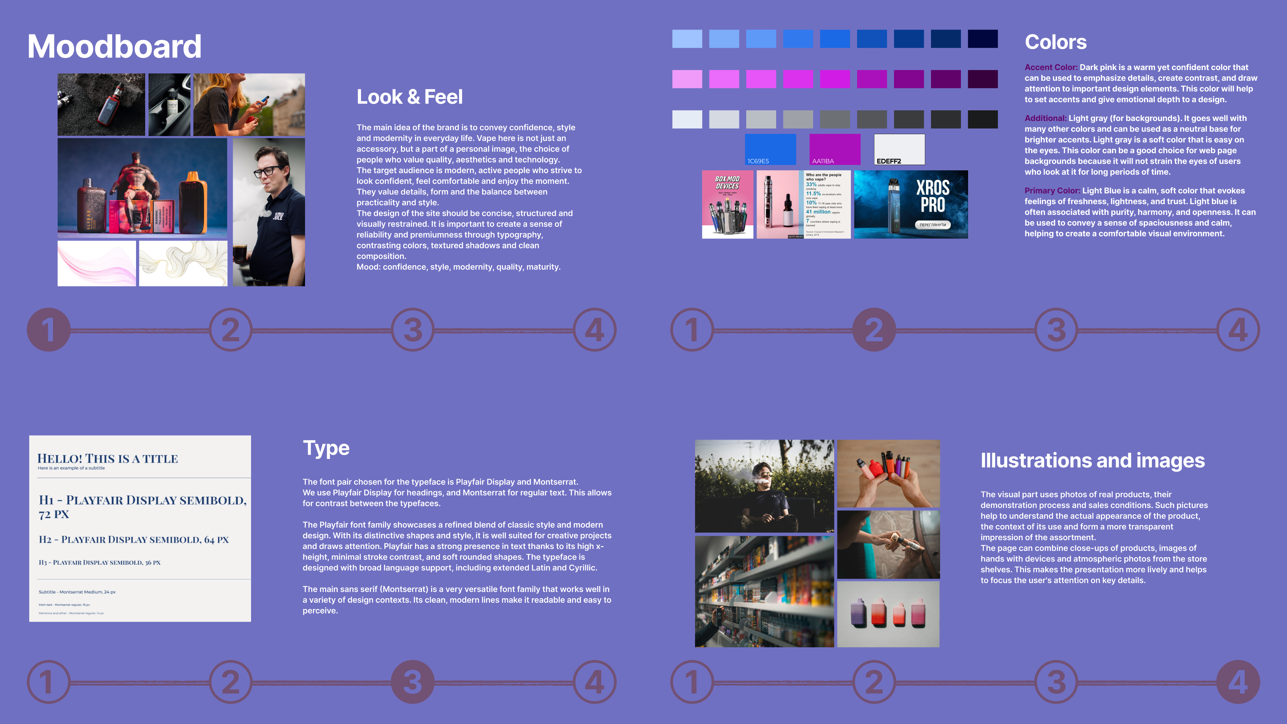
Moodboard
UI та UI kit
Heuristic
Edge cases
Summary

Background
We were designing a website for selling vapes and accessories. Smoke Dragon is a fictional company selling vapes, filters, and refills in Lviv, which is used as a concept for an educational project.
While working on the project, we encountered the problem that online purchasing of vaping products is often inconvenient and time-consuming.
Our goal is to make the online ordering process as convenient and fast as possible. The user should be able to easily find the product they need, view basic information, and make a purchase without unnecessary actions, without leaving home. This project was aimed at solving this problem.
Problem Statement
Most online vape shops offer a wide range of products, but the process of choosing a product remains inconvenient for the user. Catalogs are often overloaded, and navigation is structured in such a way that finding a specific flavor, brand, or type of device is difficult and time-consuming.
In many cases, the filtering and search functionality works inefficiently or is limited, forcing the user to manually browse through a large number of products. Information about the availability of the product is also often not obvious, which creates additional frustration.
As a result, the user's path to purchase increases, the convenience of interaction with the site decreases, and the store itself loses potential sales. This shows the need for a more thoughtful UX solution focused on quick selection and a comfortable shopping experience.

Research insites
Competitive Analysis
Found:
- Many stores have a large assortment, but:
- inconvenient filters
- do not have a qualitatively implemented Filtering and Search functionality.
- availability is not always visible
- Does not have the Recommended Products and Discounts/Promotions function, the visual style and UI functionality is implemented "minimalist, but not uniquely".
- Filters "are not applied immediately" and "lead to the result nothing found".
Users
- 18–50 years old
- Often buy disposables, liquids and POD systems
- Appreciate the speed, simplicity and accessibility of the catalog
Pain Points
- Long search for what you need
- Filters sometimes do not work or are limited
- Little clear information about the product

Key insights
- The main thing is to easily find the product in 3–5 seconds
- Filters and categories should be on the first screen
- Photos and short descriptions should be immediately visible
- There should be personal recommendations, promotions and a system of motivations for repeat purchases
Idea, Lo-fies
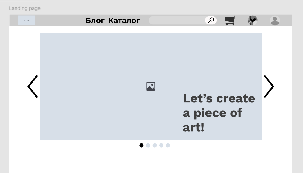
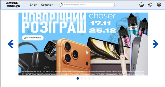
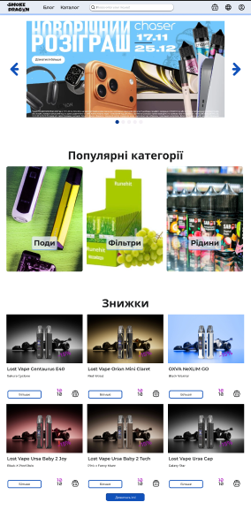
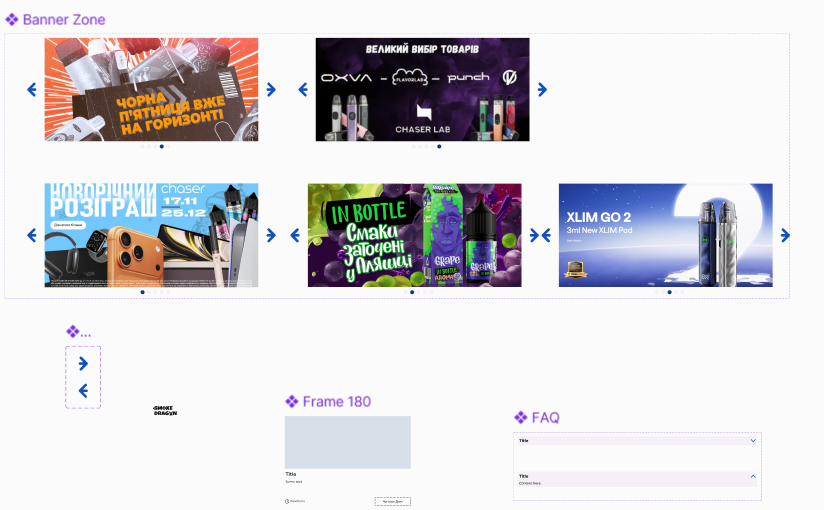
Large banner with main events and offers, draws attention
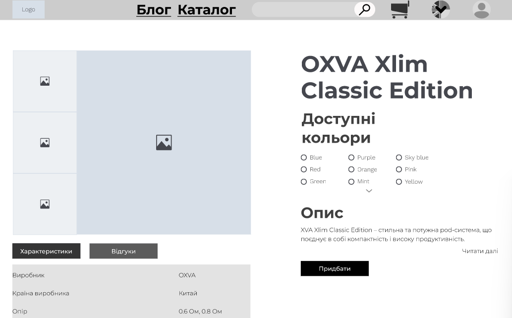
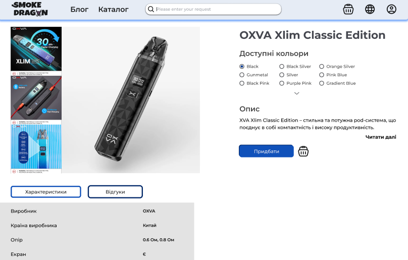
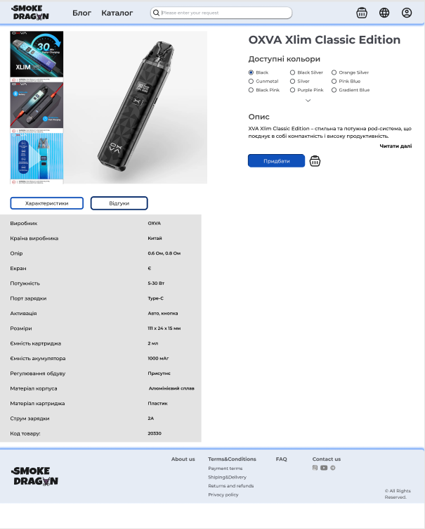
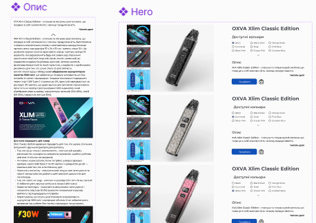
Product page, with the ability to quickly view a product image gallery, description, specifications, choose a color, and purchase the product.
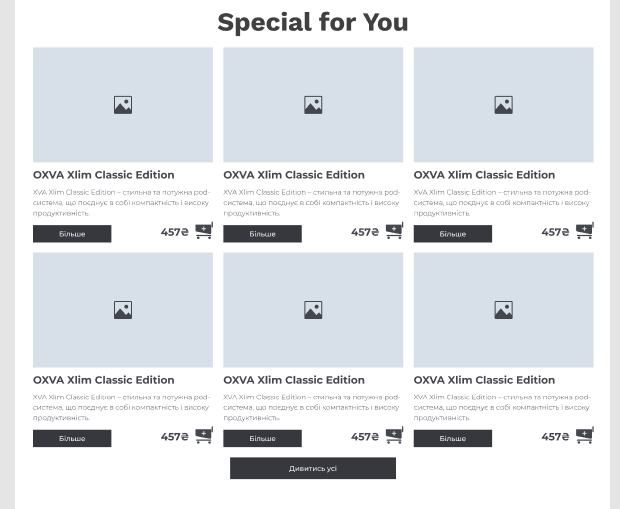
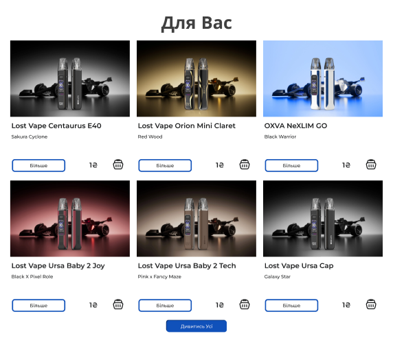
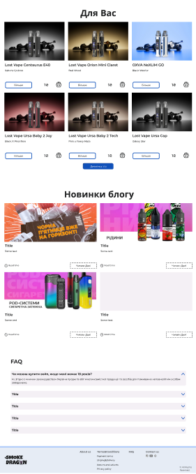
The “Especially for you” block is designed to recommend products to the buyer based on their actions while they scroll down the landing page.
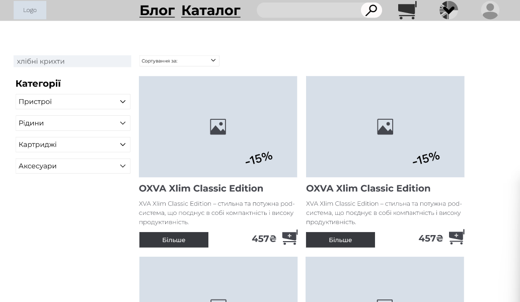
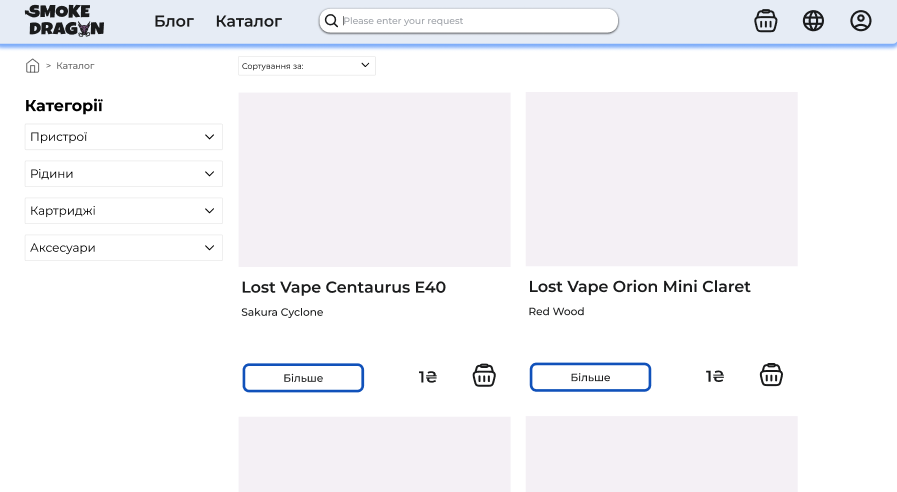
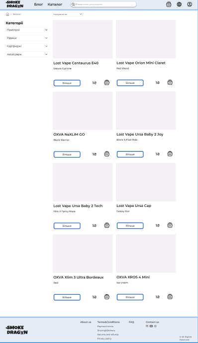
Product catalog, convenient filtering and sorting of products.
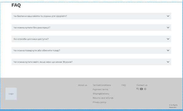
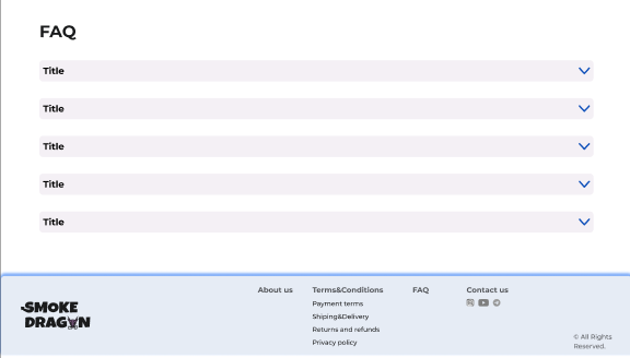
Classic block with answers to frequently asked questions.
Hi-fies
Large banner with main events and offers, draws attention
Product page, with the ability to quickly view a product image gallery, description, specifications, choose a color, and purchase the product.
The “Especially for you” block is designed to recommend products to the buyer based on their actions while they scroll down the landing page.
Product catalog, convenient filtering and sorting of products.
Classic block with answers to frequently asked questions.
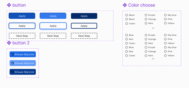
UI
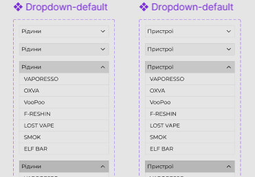
UI Kit
Heuristic
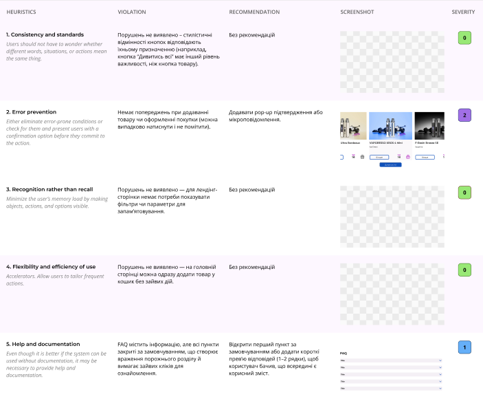
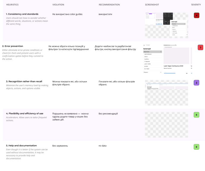
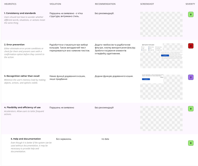
Heuristic analysis of our UIs was conducted to identify UX issues.
Main shortcomings:
- No color guides used (In the catalog).
- Unable to select multiple items in filters and click confirm (In the catalog).
- No add to cart function, only purchase (Product page).
- No warnings when adding a product or making a purchase (Landing).
Edge cases
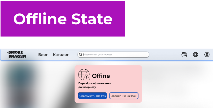
The user opens a page, but the device loses access to the internet. The app or site cannot load content, update data, or perform an action that requires a network connection.
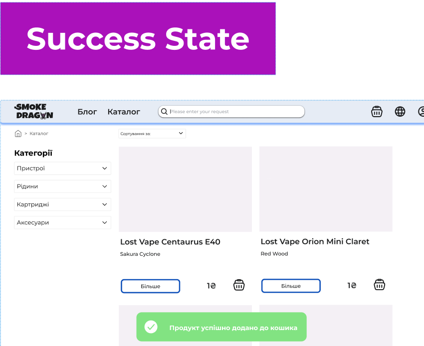
The user adds the selected product to the cart and receives confirmation of the action taken.
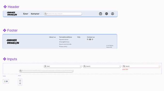
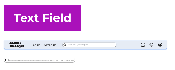
The input field has a minimum width of 452 pixels and a maximum width of 564 pixels. Within this range, the field's length is scaled to fit the content. After this length, the text in the field will scroll horizontally.
Conclusion
We developed a website design specializing in the sale of vapes and accessories. During our work, we analyzed the main problems of existing online vapes and came to the conclusion that they have a complex and non-intuitive process of selecting and purchasing goods.
Therefore, we implemented convenient navigation, a clear catalog structure, effective filtering, and quick access to basic product information in our project. This allows us to minimize unnecessary actions, reduce the time it takes to find the right product, and increase the overall comfort of interacting with the site.
The visual part of the project emphasizes the main idea of the brand - confidence, style, and modernity. Our design creates a sense of reliability and premiumness that meets the expectations of the target audience.
As a result, the project demonstrates how a well-thought-out UX/UI solution can improve the user experience and positively affect the effectiveness of online sales, forming an attractive brand image.
I craft intuitive digital experiences through research and clean design.
Back to Projects
Portfolio
Smoke Dragon
Agenda
Background
Problem Statement
Research insites
Wireframes
Moodboard
UI та UI kit
Heuristic
Edge cases
Summary

Background
We were designing a website for selling vapes and accessories. Smoke Dragon is a fictional company selling vapes, filters, and refills in Lviv, which is used as a concept for an educational project.
While working on the project, we encountered the problem that online purchasing of vaping products is often inconvenient and time-consuming.
Our goal is to make the online ordering process as convenient and fast as possible. The user should be able to easily find the product they need, view basic information, and make a purchase without unnecessary actions, without leaving home. This project was aimed at solving this problem.
Problem Statement
Most online vape shops offer a wide range of products, but the process of choosing a product remains inconvenient for the user. Catalogs are often overloaded, and navigation is structured in such a way that finding a specific flavor, brand, or type of device is difficult and time-consuming.
In many cases, the filtering and search functionality works inefficiently or is limited, forcing the user to manually browse through a large number of products. Information about the availability of the product is also often not obvious, which creates additional frustration.
As a result, the user's path to purchase increases, the convenience of interaction with the site decreases, and the store itself loses potential sales. This shows the need for a more thoughtful UX solution focused on quick selection and a comfortable shopping experience.

Research insites
Competitive Analysis
Found:
- Many stores have a large assortment, but:
- inconvenient filters
- do not have a qualitatively implemented Filtering and Search functionality.
- availability is not always visible
- Does not have the Recommended Products and Discounts/Promotions function, the visual style and UI functionality is implemented "minimalist, but not uniquely".
- Filters "are not applied immediately" and "lead to the result nothing found".
Users
- 18–50 years old
- Often buy disposables, liquids and POD systems
- Appreciate the speed, simplicity and accessibility of the catalog
Pain Points
- Long search for what you need
- Filters sometimes do not work or are limited
- Little clear information about the product

Key insights
- The main thing is to easily find the product in 3–5 seconds
- Filters and categories should be on the first screen
- Photos and short descriptions should be immediately visible
- There should be personal recommendations, promotions and a system of motivations for repeat purchases
Idea, Lo-fies
Large banner with main events and offers, draws attention
Product page, with the ability to quickly view a product image gallery, description, specifications, choose a color, and purchase the product.
The “Especially for you” block is designed to recommend products to the buyer based on their actions while they scroll down the landing page.
Product catalog, convenient filtering and sorting of products.
Classic block with answers to frequently asked questions.
Hi-fies
Large banner with main events and offers, draws attention
Product page, with the ability to quickly view a product image gallery, description, specifications, choose a color, and purchase the product.
The “Especially for you” block is designed to recommend products to the buyer based on their actions while they scroll down the landing page.
Product catalog, convenient filtering and sorting of products.
Classic block with answers to frequently asked questions.
UI
UI Kit
Heuristic
Heuristic analysis of our UIs was conducted to identify UX issues.
Main shortcomings:
- No color guides used (In the catalog).
- Unable to select multiple items in filters and click confirm (In the catalog).
- No add to cart function, only purchase (Product page).
- No warnings when adding a product or making a purchase (Landing).
Edge cases
The user opens a page, but the device loses access to the internet. The app or site cannot load content, update data, or perform an action that requires a network connection.
The user adds the selected product to the cart and receives confirmation of the action taken.
The input field has a minimum width of 452 pixels and a maximum width of 564 pixels. Within this range, the field's length is scaled to fit the content. After this length, the text in the field will scroll horizontally.
Conclusion
We developed a website design specializing in the sale of vapes and accessories. During our work, we analyzed the main problems of existing online vapes and came to the conclusion that they have a complex and non-intuitive process of selecting and purchasing goods.
Therefore, we implemented convenient navigation, a clear catalog structure, effective filtering, and quick access to basic product information in our project. This allows us to minimize unnecessary actions, reduce the time it takes to find the right product, and increase the overall comfort of interacting with the site.
The visual part of the project emphasizes the main idea of the brand - confidence, style, and modernity. Our design creates a sense of reliability and premiumness that meets the expectations of the target audience.
As a result, the project demonstrates how a well-thought-out UX/UI solution can improve the user experience and positively affect the effectiveness of online sales, forming an attractive brand image.
I craft intuitive digital experiences through research and clean design.
Back to Projects